
Navigating Worklink
A guided tour of the Worklink screen: the header, the tab bar, the All Modules menu, the command palette and the two layouts.
Worklink holds a lot, and it is all reached from two strips at the top of the window: a header that stays the same wherever you are, and a tab bar that changes with you. Here is what each piece of it does.
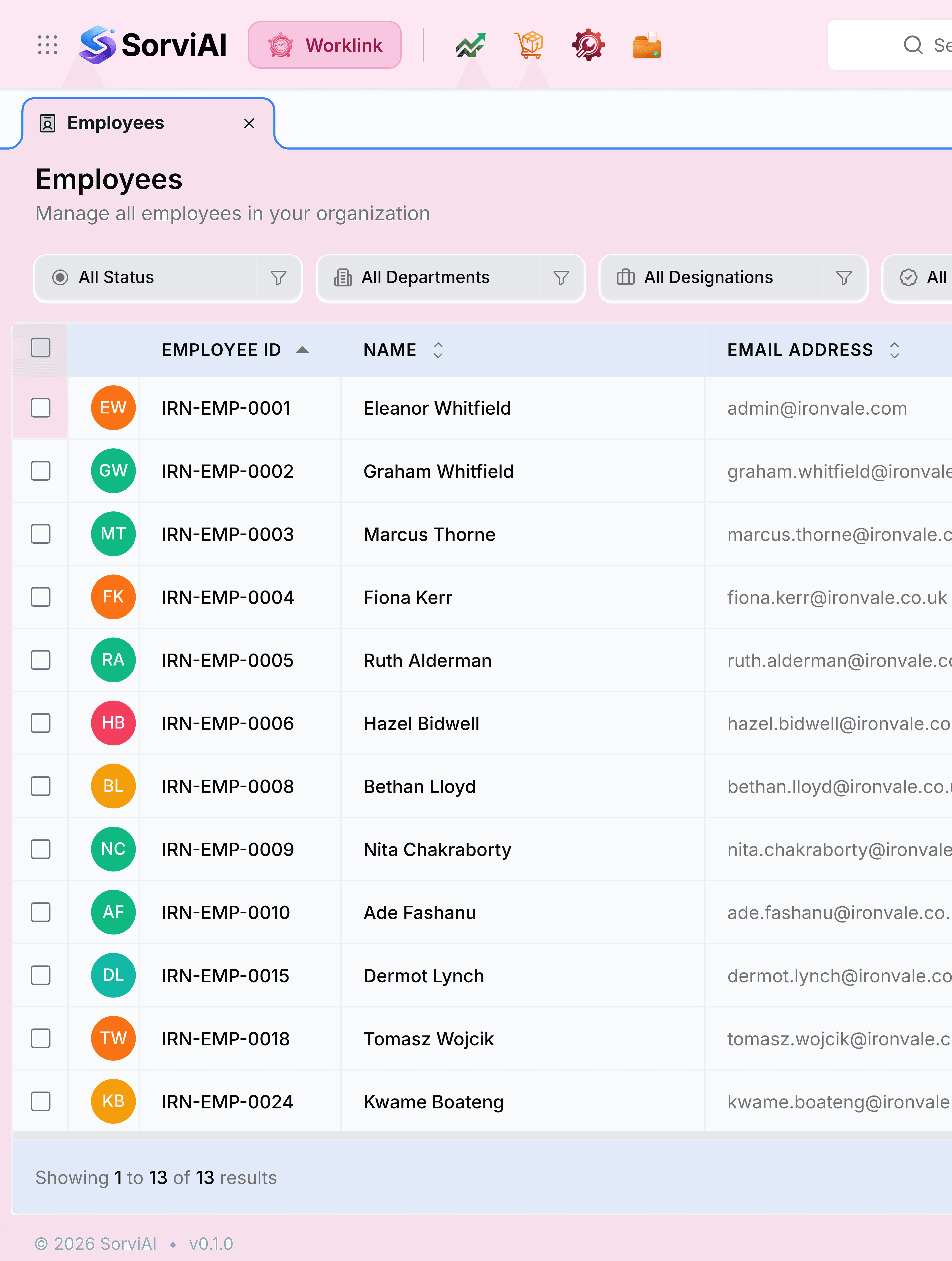
- App switcher
- The grid of dots at the far left. Opens the other SorviAI apps you have access to, and it is the only way to change app from here.
- Worklink
- The pill naming the app you are in, with your starred apps as icons beside it for a one-press hop between them.
- Search
- The box in the middle. It is pointed at the screen you are on, so its placeholder changes as you move.
- Check in
- The clock icon on the right, and it is Worklink's own. Before you start it checks you in; after that it becomes your work session, showing time worked and offering a break or a check out.
- Notifications
- The bell, carrying a count when something is waiting on you.
- Settings
- The cog, which opens Worklink's settings rather than the suite's.
- Your profile
- The avatar at the far right: the light and dark theme switch, the layout switch, your own profile and the way out.
- Tab bar
- Under the header. Your starred modules live here permanently, and anything else you open joins them until you close it.
- All Modules
- At the right of the tab bar. The whole menu, grouped, with a search box of its own.
- Page header
- The screen's title, and the controls that act on the whole screen: a location picker where a screen is site-specific, and the button that creates a new record.
- Filters and list
- Below that, the filter row and the records themselves. Columns sort by selecting them, and both the filters and the widths you drag are remembered.


All Modules
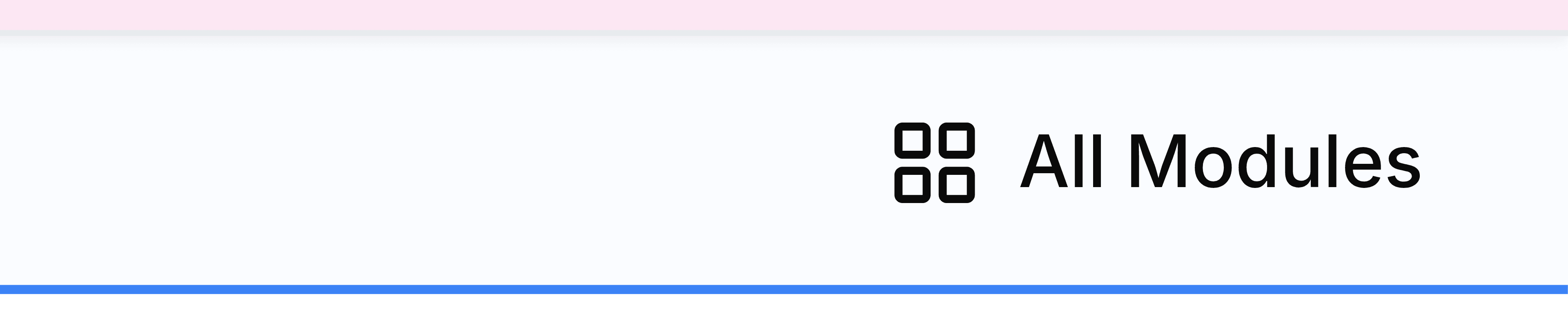
All Modules opens the full Worklink menu, grouped the way the product is organised, with a search box for finding a screen by name. Star a module there and it becomes a tab you can return to in one press.
| Group | Screens |
|---|---|
| Other Modules | Overview, My Attendance, Presence, Reports, User Guide |
| Self Service | Attendance, Attendance Records, Leave Balance, Leaves, Holiday Calendar, Training |
| Teams | Team Records, Team Leaves |
| Attendance | Records, Calendar |
| Leave Management | Leaves, Approvals, Leave Balance, Holiday Calendar |
| Employee Management | Employees, Departments, Designations |
| Operations | Shifts, Regularizations, Visitor Management, Training, My Training, Offboarding, Announcements |
Nobody sees all of that at once, and the differences are three different jobs rather than gaps in your permissions.
- An administrator
- Gets Overview, Presence and the Self Service group, which gathers the personal screens everybody else reaches separately.
- An employee
- Gets My Attendance and My Training as rows of their own in place of the Self Service group, and no Overview.
- A team lead
- Gets the Teams group as well, holding the same two questions about the people who report to them.
The search bar
The search bar sits in the header on every screen, and its placeholder tells you what it is pointed at. On a list screen it searches that list rather than the whole app, and it does one of two things with what it finds.
| Where you are | What the search bar does |
|---|---|
| Employees, Departments, Designations, Training, Visitor Management, Offboarding | Drops a list of matching records. Select one to open the record itself. |
| Records, Leaves, Approvals, Leave Balance, Shifts, Regularizations | Filters the list in front of you, and keeps the term in the address so the view can be shared. |
The command palette
Worklink carries a command palette the other apps do not: one box that reaches a screen, an employee, a visitor or a department without going through the menu first.
Press Ctrl+K, or Cmd+K
The palette opens over whatever you were looking at, with the cursor already in it. Escape closes it again.
Enter a name, or part of one
Results arrive grouped: pages first, then the employees, visitors and departments that match.
Select a result
It opens the record or the screen. The five quick actions above the results (Add Employee, Log Visitor, Add Department, Apply Leave and Create Training) start the job instead of finding it.
Two layouts
Worklink ships two navigation shapes and remembers which you chose. Both reach the same screens.
Modern
the default
- YesA tab bar across the top
- YesAll Modules for the full menu
- YesStarred modules become tabs
- NoEvery group listed on screen at once
Classic
- YesA left sidebar listing every group
- YesGroups expand in place
- NoAn All Modules button, because the sidebar is the menu
- NoTabs across the top
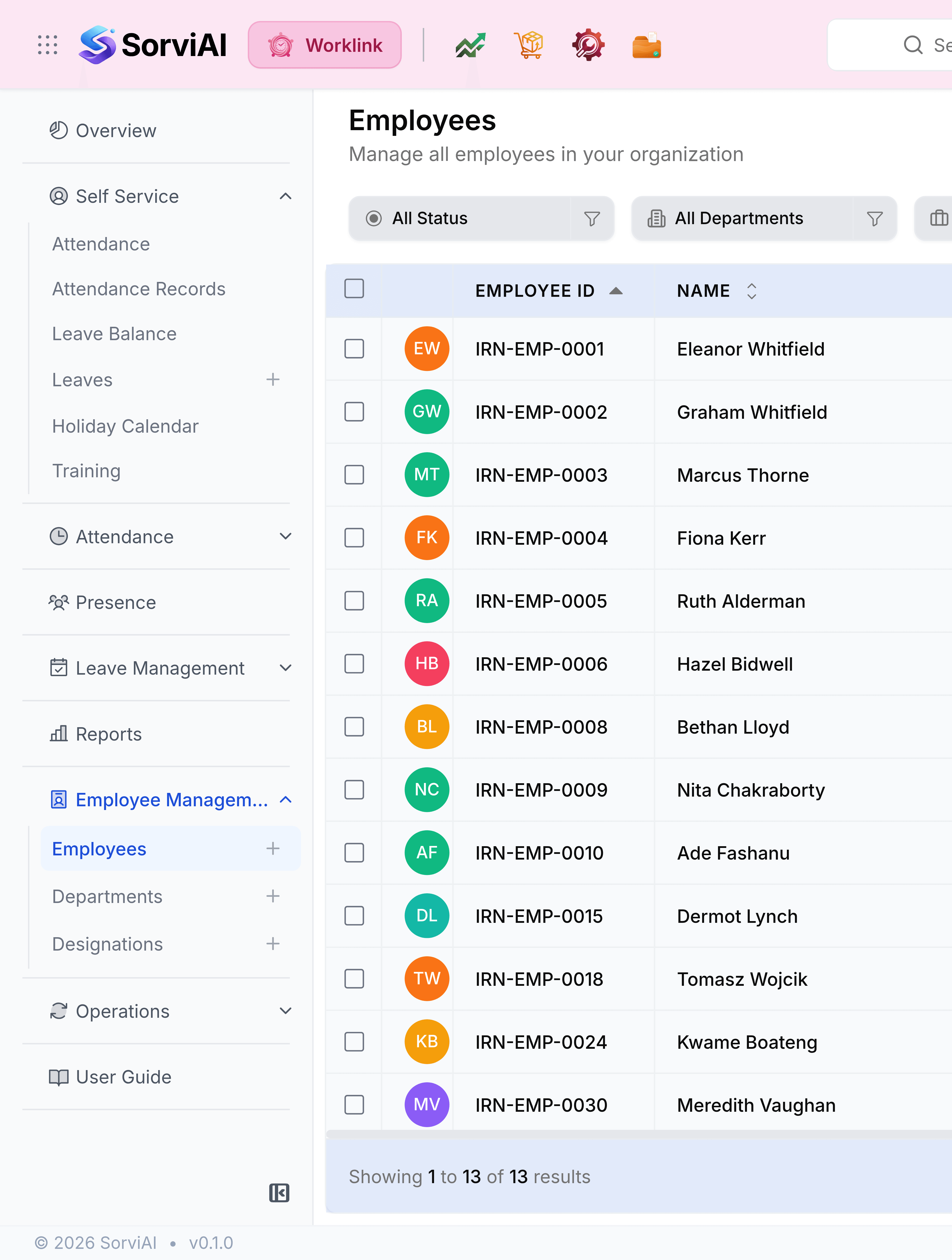
Both live under your avatar at the top right, beside the light and dark theme switch.