
What the theme controls
One screen sets the store name, the logo, the brand colours, the hero background, the header button and the footer, for every page at once.
The theme is the one screen that reaches every page of the store at once. Nothing here is per product or per collection: change a colour and it changes everywhere.
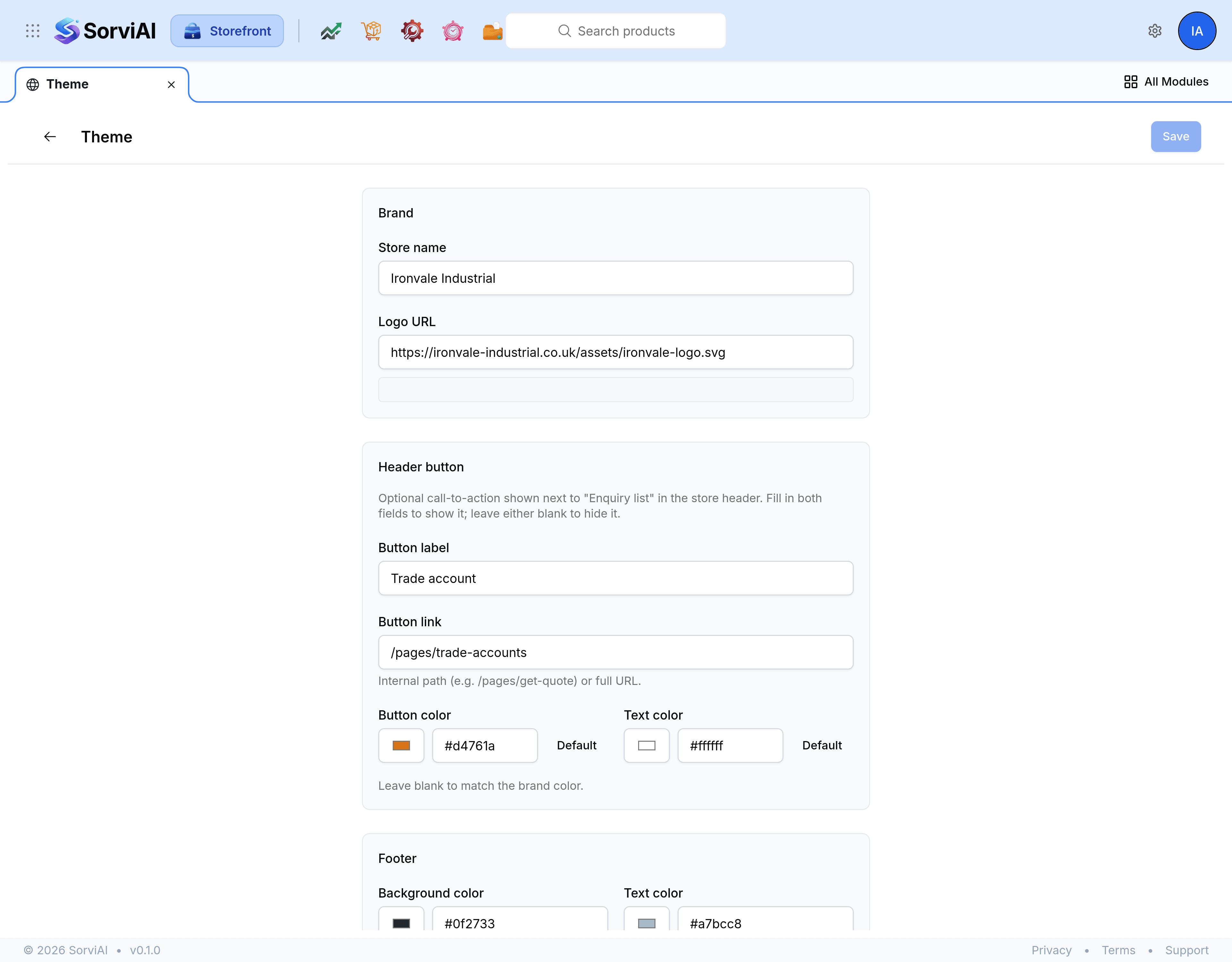
The five groups
They are laid out in this order down the screen, which is not the order you would guess and is worth knowing before you go looking for one.
- Brand
- The store name and the logo. What stands for the shop wherever it is named rather than pictured.
- Header button
- One optional call to action in the store header, beside Enquiry list.
- Footer
- The background and text colours at the foot of every page, with a preview strip underneath them.
- Colors
- A primary and a secondary colour, which the rest of the design is built from.
- Hero background
- The band the homepage opens on, filled with a solid colour, a gradient, a texture or an image.
Work in the preview
A preview sits beside the fields and updates as you change them, so the effect of a colour is visible before it is saved. Change one field, look, then change the next. Choosing five colours and then looking is how a store ends up with a palette nobody can explain.
What the two brand colours do
- Primary
- The colour doing the work: buttons, links, and anything the design wants a visitor to move towards.
- Secondary
- The darker supporting tone, used behind and around the primary rather than competing with it.
Several fields elsewhere on the screen can be left empty, or set to Default, to fall back to these two. That is usually the right answer: a header button with no colour of its own picks up the brand, and stays right when the brand changes.
On the homepage hero the two colours do something narrower than people expect. They set the hero's heading and description text; the background behind that text is whatever Hero background says, and nothing else.