
Design the hero and footer
Fill the band the homepage opens on, add the one call-to-action button in the store header, and set the colours at the foot of every page.
Three groups decide what a visitor sees at the very top and the very bottom of the store: the hero behind the homepage's opening band, the one button in the store header, and the footer under every page.
Fill the hero background
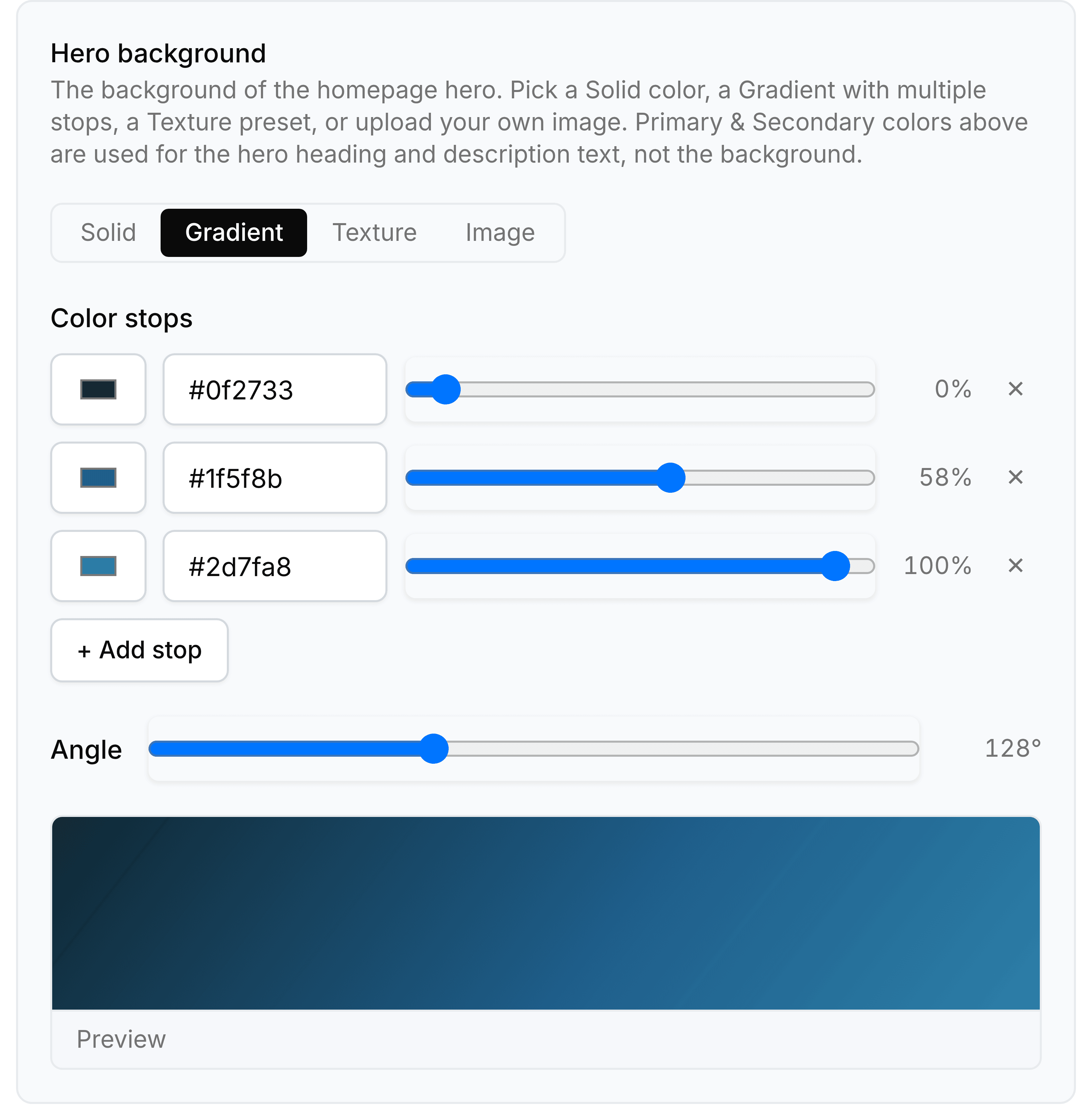
The four choices across the top of the card decide which fields the rest of it shows.
- Solid
- One background colour, and nothing else to decide.
- Gradient
- Two or more colour stops, each with its own position along the band, plus an angle for the direction it runs.
- Texture
- One of the presets, tinted with a colour of your choosing.
- Image
- An address pointing at a file you host.
Go to Theme and scroll to Hero background.
Choose Solid, Gradient, Texture or Image.
For a gradient, set each stop's colour and position, and use Add stop for another.
Set the Angle for the direction the gradient runs.
Check the preview at the foot of the card, then select Save.
Add the header button and set the footer
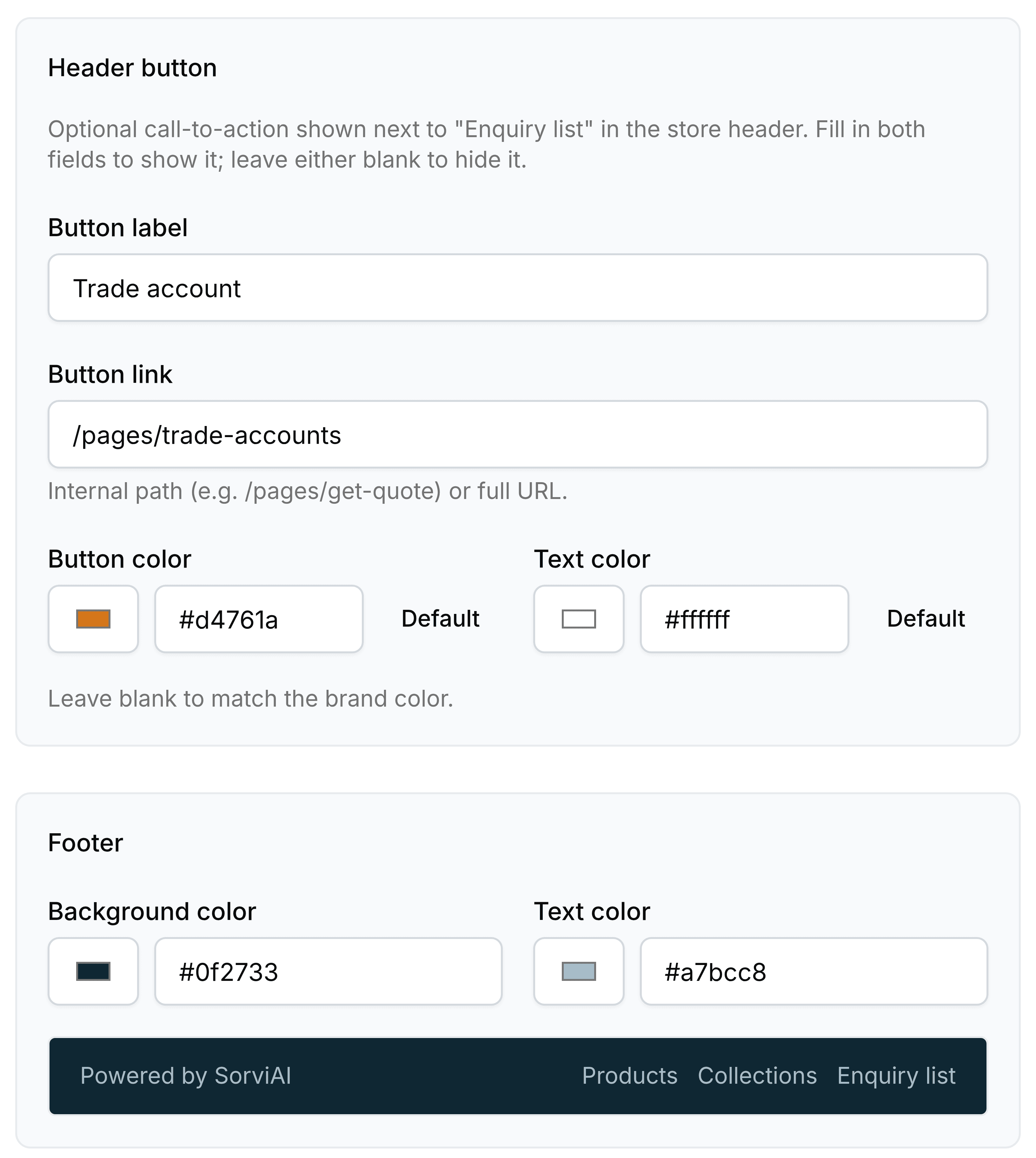
The Header button is one call to action carried in the header of every page, next to Enquiry list. It appears only when both of its first two fields are filled in, so leaving either empty is how you hide it.
| Field | What it does |
|---|---|
| Button labelRequired | The words on the button, such as Trade account. |
| Button linkRequired | Where it goes. An internal path such as /pages/trade-accounts, or a full address. |
| Button color | The background. Select Default, or leave it empty, to use your brand colour. |
| Text color | The words on the button. Default uses the matching brand tone. |
| Background color | The footer's own background, under every page. |
| Text color (Footer) | The footer's wording, previewed on the strip underneath. |